
Matte vs Gloss vs Kraft Paper Labels: Which Finish Is Right for Your Product?
TL;DR
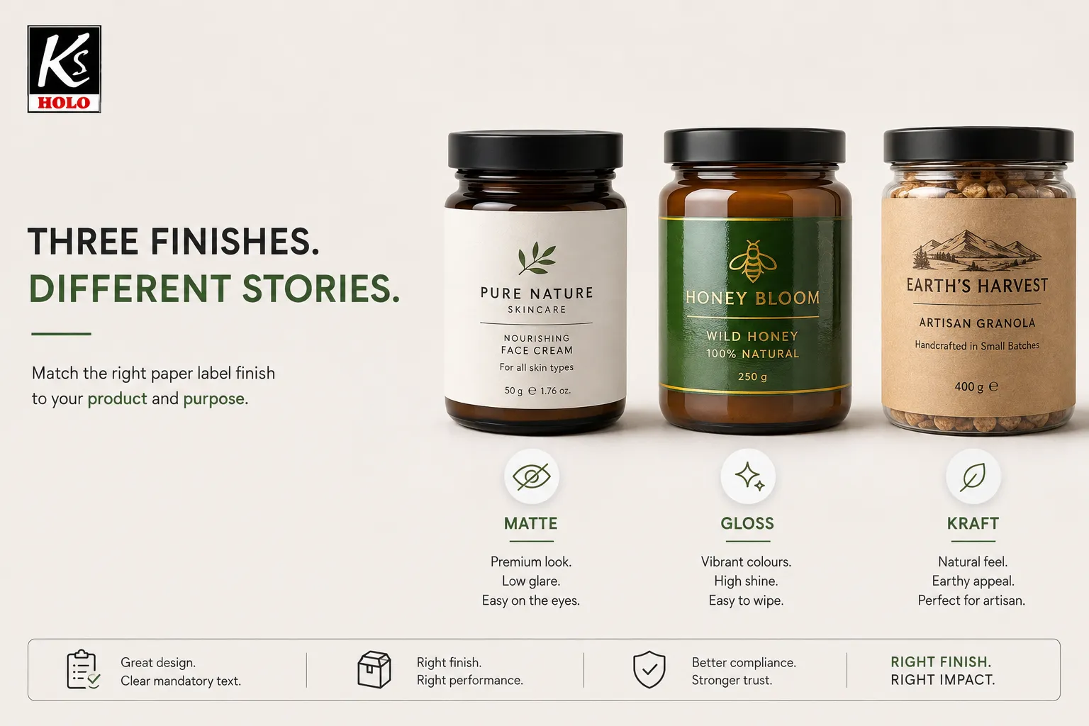
Paper label finishes India buyers choose most often are matte, gloss, and kraft—each signals a different shelf story. Matte reads premium and low-glare; gloss boosts colour pop and wipeability; kraft suggests natural or artisanal. Match finish to product, handling, and mandatory text legibility—not trend alone.
DEFINITION
Definition — Paper label finishes are the surface treatments and stock choices—typically matte, gloss (or semi-gloss), and kraft—that determine how a printed paper label looks, feels, resists scuffs, and photographs on shelf; a label material comparison for Indian brands should weigh brand cue, print contrast, moisture/oil exposure, and whether mandatory declarations stay clear and attached in use.
Finish is not decoration bolted on at the end. It changes colour saturation, fingerprint visibility, barcode contrast, and how “premium” or “natural” a jar looks in a marketplace photo. For food and FMCG especially, the label must also stay on the pack and remain readable. FSSAI’s Labelling and Display framework requires that label particulars be clear, conspicuous, and readily legible, and that the label be applied so it will not become separated from the container. That is why paper label finishes India decisions sit at the intersection of brand design and compliance practicality.
EVIDENCE
Under FSSAI Labelling and Display general requirements for pre-packaged foods, label contents must be clear, unambiguous, prominent, conspicuous, indelible and readily legible under normal conditions of purchase and use, and the label must be applied so it will not become separated from the container.
Source: FSSAI — Food Safety and Standards (Labelling and Display) Regulations, 2020 (compendium)
What is the difference between matte and gloss paper labels?
What is the difference between matte and gloss paper labels?
QUICK ANSWER
Matte paper labels use a low-shine coating that softens glare and often feels more premium or editorial; gloss (or glossy) labels use a reflective coating that makes colours appear richer and can wipe cleaner. Matte hides fingerprints better in photos; gloss usually shows higher colour pop under retail lights. Neither finish is universally “better”—it depends on product category and handling.
QUOTABLE SPECS — paper label finishes India
| Finish ≠ waterproof | Matte/gloss/kraft is appearance. Moisture and oil resistance come mainly from face stock + adhesive (e.g. paper vs film/BOPP), not shine alone |
| Paper vs film (BOPP) | Use paper for dry indoor retail looks; consider film/BOPP constructions when chill, condensation, or wipe-down dominate — then choose matte or gloss on that film |
| Kraft practical limit | Kraft is usually best for dry, indoor artisanal cues; confirm edge lift on oil/chill packs before claiming durability |
| FSSAI contrast check | Mandatory text must stay clear, conspicuous, readily legible; keep high contrast on kraft/dark matte (light panel behind small type) |
| Semi-gloss middle path | Often best FMCG compromise: more colour than matte, less mirror glare than high gloss |
| Sample rule | Approve finish only after photos + adhesion trial on the real jar/bottle/pouch |
Confirm exact film, adhesive, and die on a pack sample before freezing the PO — values above are typical manufacturing ranges used for quoting, not a universal guarantee.
Matte label vs gloss label — practical differences
- Look — matte: soft, modern, low reflection; gloss: vivid, wet-look colour, high reflection.
- Touch — matte: paper-like / velvet cue; gloss: smoother, more “laminated” feel.
- Photography — matte: fewer hotspots for D2C; gloss: stronger colour but glare risk.
- Handling — matte: can show scuffs on dark solids; gloss: often more wipe-friendly for light soil.
- Text — both can carry fine type if print quality is high; test small mandatory text on the real stock.
| Factor | Matte | Gloss / glossy |
|---|---|---|
| Shelf cue | Premium, calm, boutique | Bright, commercial, high impact |
| Colour pop | Softer / muted | Stronger saturation |
| Glare in photos | Lower | Higher |
| Fingerprints | Usually less obvious | More visible on dark panels |
| Typical use | Skincare, specialty tea, premium spices | Mass FMCG, confectionery, promo packs |
A matte label vs glossy sticker India brief should always include substrate (glass, PET, pouch), oil/moisture exposure, and whether the label sits under fridge lights or outdoor kirana lighting.
For a wider materials and sourcing view, see Paper Label Manufacturer in India: Your Guide to Premium Custom Labels.
MYTH
"Gloss always looks more expensive than matte."
REALITY
In many beauty, specialty food, and D2C categories, matte reads more premium today. Gloss still wins where colour drama and wipe-down matter. Price perception comes from fit to category—not shine alone.
MYTH
“Gloss labels are waterproof; matte and kraft are not.”
REALITY
Finish is not the same as material. A glossy paper label can still fail in condensation if the adhesive and paper construction are wrong. Film/BOPP stocks (matte or gloss) usually outperform uncoated paper in wet or oily handling. Specify environment first, then finish aesthetics.
FSSAI LEGIBILITY CHECKLIST
- Proof the smallest mandatory point size on the approved finish (matte, gloss, or kraft).
- Keep FSSAI logo / licence block in high contrast against the label background.
- On kraft or dark matte, put nutrition/ingredients on a light panel — do not bury grey type on brown fibre.
- Confirm the label will not separate from the container after chill, wipe, or transit abrasion.
- Photograph under kirana / fridge lighting — glare that hides text fails the “readily legible” test in practice.
Which label finish looks best on food packaging?
Which label finish looks best on food packaging?
QUICK ANSWER
The best paper label finish for food packaging depends on the product story and the pack environment. Gloss suits colourful snacks and mass retail visibility; matte suits premium oils, specialty foods, and low-glare photography; kraft suits artisanal, organic-leaning, or farm-to-jar cues—provided mandatory text stays legible and the adhesive holds in cold or oily conditions.
Use this quick filter for paper label finish for food packaging:
- High colour, kids’ snacks, confectionery — gloss or semi-gloss for pop.
- Premium oils, sauces, specialty pantry — matte for calm brand hierarchy.
- Artisanal pickles, millets, farm brands — kraft paper sticker look for natural cue.
- Cold chain / condensation — prioritise adhesive and wrap test before finish fashion.
- Oily products — check varnish and edge lift; finish alone will not fix wrong adhesive.
STEP-BY-STEP
- Write the shelf story in one line — premium, vivid, or natural.
- List pack stresses — oil, fridge, humidity, abrasion in transit.
- Check mandatory text size on a printed proof of that finish.
- Photograph matte, gloss, and kraft samples under your real lighting.
- Run an adhesion trial on the actual jar, bottle, or pouch.
- Approve one finish per SKU family to keep reorders consistent.
| Food / FMCG scenario | Prefer first | Why |
|---|---|---|
| Bright masala / snack pouch | Gloss | Colour impact in crowded aisles |
| Cold-pressed oil / gourmet jar | Matte | Premium cue, softer glare |
| Organic / farm-style D2C | Kraft | Natural texture cue |
| Multilingual nutrition panel | Matte or semi-gloss | Test smallest text legibility |
| Wet wipe / chill exposure | Finish + adhesive trial | Condensation defeats pretty stock |
EVIDENCE
FSSAI Packaging Regulations require that materials that come in contact—or are likely to come in contact—with food used for packaging, storing, wrapping, transportation, and sale or service of food shall be of food-grade quality. Finish choice does not replace food-contact compliance for the packaging system.
Source: FSSAI — Food Safety and Standards (Packaging) Regulations, 2018 (compendium)
Apparel and retail brands that also specify tags alongside labels can compare finish thinking with What Are Hang Tags? A Complete Guide for Clothing Brands in India.
Are kraft paper labels eco-friendly?
Are kraft paper labels eco-friendly?
QUICK ANSWER
Kraft paper labels can support an eco-leaning look, but they are not automatically eco-friendly. Environmental performance depends on fibre source, coatings, laminates, inks, and adhesive—and on whether the label construction can be recycled in practice. Treat kraft as a design cue first; verify sustainability claims with material specs, not colour alone.
Honest eco paper label options framing for buyers:
- Kraft aesthetic — brown uncoated or lightly coated stock that signals natural/artisanal.
- What improves eco credentials — responsible fibre, fewer plastic laminates, compatible adhesives, clearer disposal messaging.
- What weakens claims — heavy film lamination, mixed materials that confuse recycling, vague “eco” marketing with no basis.
- Standards literacy — Indian kraft paper for packing/wrapping is addressed under BIS specifications such as IS 1397 (revised over time); ECO Mark-type environmental labelling concepts have been linked to kraft paper quality frameworks in BIS documentation—optional quality/environment signalling, not a free pass for every brown sticker.
DID YOU KNOW?
BIS documentation on kraft paper has included additional ECO Mark-oriented requirements for environment-friendly labelling of kraft paper—such as recyclable/reusable or biodegradable packaging of the kraft paper itself—showing that “eco” is specified, not assumed from brown colour.
Source: BIS — IS 1397 kraft paper (ECO Mark amendment text via public standard archive)
| Claim you want | Better question to ask the converter |
|---|---|
| “Looks natural” | Can we proof kraft vs matte white on our jar? |
| “More sustainable” | What is the face stock, coating, and laminate stack? |
| “Recyclable pack” | How does the label construction affect pack recycling in practice? |
| “Food-safe system” | Which layers are food-contact relevant, and what is documented? |
EXPERT OPINION
“ISO/TS 18614 provides guidelines for users and suppliers… ensuring that the relevant information is provided so that the right material for the intended application can be requested or recommended.”
— ISO/TS 18614:2016 abstract (self-adhesive label specification guidance)
Source: ISO
Indian context: shelf cues, FSSAI legibility, and Delhi sourcing
Indian retail and D2C shelves reward finish clarity. Kirana lighting, glossy pouch walls, and smartphone product photos punish glare differently than a brand deck mock-up. A kraft paper label manufacturer Delhi brief should therefore include pack photos, mandatory text size, oil/fridge exposure, and whether the brand story is premium-matte, mass-gloss, or natural-kraft.
| Buyer priority | Finish lean | Specify on the PO |
|---|---|---|
| Premium / quiet luxury | Matte | Soft glare, solid coverage, scuff check |
| Colour drama / promo | Gloss | High saturation, wipe test |
| Natural / artisanal | Kraft | Texture, ink holdout, barcode contrast |
| Food compliance | Any + proof | Legible declarations; label stays attached |
| Consistent reorders | One approved finish | Retain sample + written stock code |
FIRST-HAND EXPERIENCE
In paper-label production for Indian food and D2C brands, finish debates usually resolve after three physical proofs on the real container—not after another logo revision. Soft-touch packs change how matte reads; brown kraft can hide fine nutrition text if contrast is weak. KS Holo has manufactured paper labels and related packaging identifiers in India since 2002, with end-to-end in-house production; finish recommendations start from the jar, pouch, or bottle in hand.
When you need a side-by-side matte, gloss, and kraft proof on your pack—or a kraft paper label manufacturer Delhi conversation on stock and adhesive—request a finish sample discussion with KS Holo on WhatsApp. Brands that also combine security seals with paper packs can review vendor questions in How to Choose a Hologram Label Manufacturer: 5 Key Questions.
Frequently Asked Questions
Is semi-gloss a better middle path than matte or high gloss?
QUICK ANSWER
Often yes for FMCG. Semi-gloss keeps more colour than matte with less mirror glare than high gloss. It is a practical compromise for nutrition panels and barcode contrast. Still proof on the real pack—semi-gloss is a family of coatings, not one universal stock.
Will kraft paper stickers work on clear PET bottles?
QUICK ANSWER
They can, if adhesive and wrap geometry are right, but expect a different visual: kraft reads opaque and textured against clear plastic. Test edge lift on curves and check whether barcode contrast meets your scanner needs. Some brands reserve kraft for secondary labels or sleeves instead.
Does a matte finish make small FSSAI text harder to read?
QUICK ANSWER
Not automatically—but low contrast designs on heavily textured or dark matte stocks can reduce legibility. Keep mandatory text high-contrast, proof the smallest point size on the approved finish, and avoid burying declarations in low-contrast kraft browns without a white or light panel.
Can I use gloss on the front and kraft on a neck label?
QUICK ANSWER
Yes, if the brand system stays coherent and reorders stay controlled. Mixed finishes work when each label has a job—hero billboard versus natural cue. Document stock codes so packing teams do not swap rolls between SKUs.
Are eco paper label options limited to kraft?
QUICK ANSWER
No. Matte or gloss face stocks can also be part of a lower-impact construction depending on fibre, coatings, and laminates. Kraft is a visual shorthand for “natural,” not a complete sustainability certificate. Ask for material specs before publishing eco claims.
What should I send when requesting a label material comparison sample?
QUICK ANSWER
Send pack photos or empty containers, size/die line, expected oil or chill exposure, mandatory text hierarchy, and whether you want matte, gloss, kraft, or all three. Note printer marks, barcode needs, and application method. Physical proofs beat PDF mock-ups for finish decisions.
QUICK SUMMARY
Which paper label finish is right for your product in India?
Choose by shelf story and pack stress—not by trend alone.
A clear finish decision can:
- ✓ Align matte, gloss, or kraft with brand positioning
- ✓ Protect mandatory text legibility on food packs
- ✓ Reduce photo glare or colour disappointment after print
- ✓ Keep reorders consistent with an approved stock code
It cannot replace:
- ✗ Food-grade packaging compliance where required
- ✗ Adhesive and application trials on the real container
- ✗ Evidence behind any eco or recyclability claim